Join our network of over 200+ hotels growing their direct revenue online. Get Started
Join our partner networks of over 200+ hotels. Get Started
View what our clients say about us. Testimonials

When Club Wyndham Asia approached Placeworks to develop their Wynham Club Asia website, the task was clear: make it easy for members to manage their club functionality, bookings, access their credentials, and provide a seamless path for new users to sign up. And do it all without the fluff.
This wasn’t about pushing a generic hotel site template onto a different region and hoping it worked. Club Wyndham Asia needed something that reflected their unique membership model and the diverse range of properties they offer across Asia. The solution had to balance brand consistency with the user expectations in the region, all while ensuring it performed well from a technical standpoint.


Wyndham’s Asia site isn’t just a standard hotel booking platform. It’s a hub for members to access everything from booking availability to exclusive member benefits. On top of that, it also serves as a point of entry for new members signing up. Placeworks was tasked with creating a website that felt like a natural extension of Wyndham’s physical experience — without turning it into a hard sell. The site had to speak to a luxury-focused audience while keeping things functional and, above all, user-friendly.
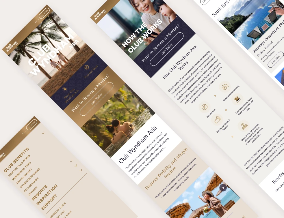
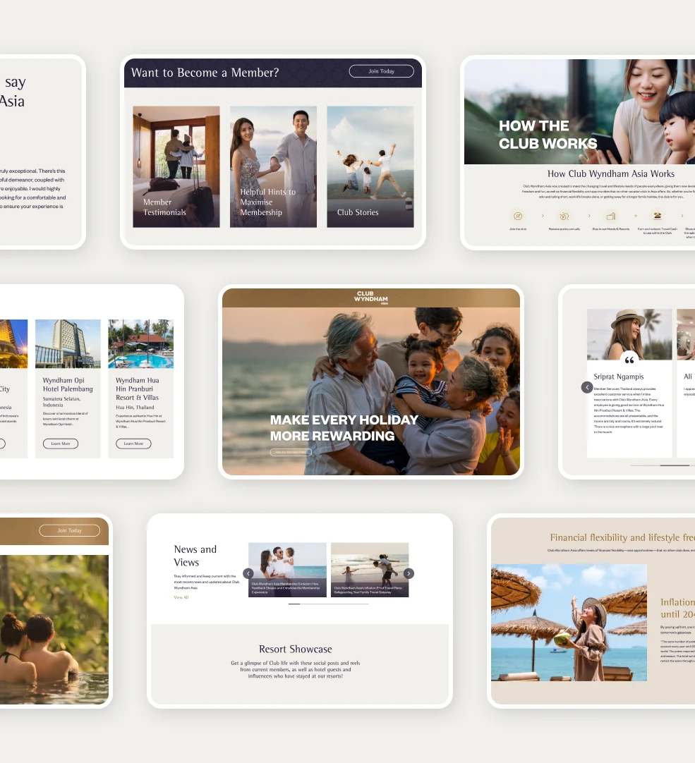
There’s no one-size-fits-all when it comes to visual identity, and the same applies here. The colour palette was deliberately chosen to align with Club Wyndham’s luxury appeal in the region. A mix of deep blues and whites set the tone for a sophisticated experience, evoking a sense of calm and relaxation that mirrors what guests expect at Wyndham properties. The consistent use of these colours across the site helped maintain a connection with Wyndham’s brand, but with a more tailored, regionally appropriate look.
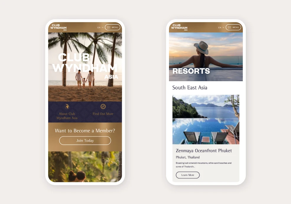
Visuals weren’t just an afterthought; they were central to the design. High-resolution images of Wyndham’s properties were strategically placed to immerse visitors into the experience of each location. Whether it’s a beachfront property or an urban getaway, the images do the talking. The goal wasn’t to bombard users with clichés, but rather to show the unique selling points of each destination. Carefully selected images were used to create a virtual experience that would entice potential members while offering existing ones a sense of pride in their membership.

Functionality That Works
Navigation and Usability
It doesn’t matter how good your website looks if users can’t find what they’re after. Placeworks implemented a streamlined navigation structure, focusing on simplicity and ease of access. The sticky navigation bar ensures that essential tools, such as booking options and account management, are always within reach, no matter where the user is on the page. The user journey is designed to be frictionless, making it easy for members to manage their bookings and for new users to navigate the sign-up process.
Conversion-Focused Design
Given that a key part of the website’s role is driving new membership sign-ups, subtle but effective calls to action (CTAs) were placed strategically throughout the site. These were designed to guide users towards taking the next step without feeling like they’re being sold to. The layout encourages a natural flow from exploration to booking, reducing reliance on third-party booking sites and keeping everything within Wyndham’s ecosystem.

With the high visual demands of a website like this, performance can’t be ignored. The team at Placeworks made use of lazy loading, optimised image formats, and other web performance techniques to ensure the site remained fast and responsive, even with the heavy use of imagery. This was particularly important for retaining users in regions with slower internet speeds, ensuring that the experience remained smooth across all devices.
The Club Wyndham Asia site needed to do more than just look good—it had to function seamlessly with Wyndham’s existing back-end systems. This included integrating with their membership database and booking system while keeping everything running smoothly on the front end. The team worked closely with Wyndham’s tech and support staff to ensure that everything connected flawlessly, from managing member credentials to real-time booking updates.
Since its launch, the Club Wyndham Asia website has seen an increase in member engagement and new sign-ups. The clean, visually engaging design has resonated with users, while the seamless functionality has made it easier for members to manage their accounts. Direct bookings have also seen a boost, as the site encourages users to stay within Wyndham’s ecosystem rather than veering off to third-party platforms.
In summary, the website for Club Wyndham Asia is a testament to Placeworks’ ability to deliver a digital experience that is not only visually aligned with the brand but also functional and easy to use. It highlights the importance of understanding regional user preferences while balancing global brand consistency, and shows how a well-thought-out digital strategy can drive tangible business results.
We're here to help our hotel partners take back control of their sales channels - we’re
happy to discuss your requirements and explore how we can increase your revenue.